
- This event has passed.
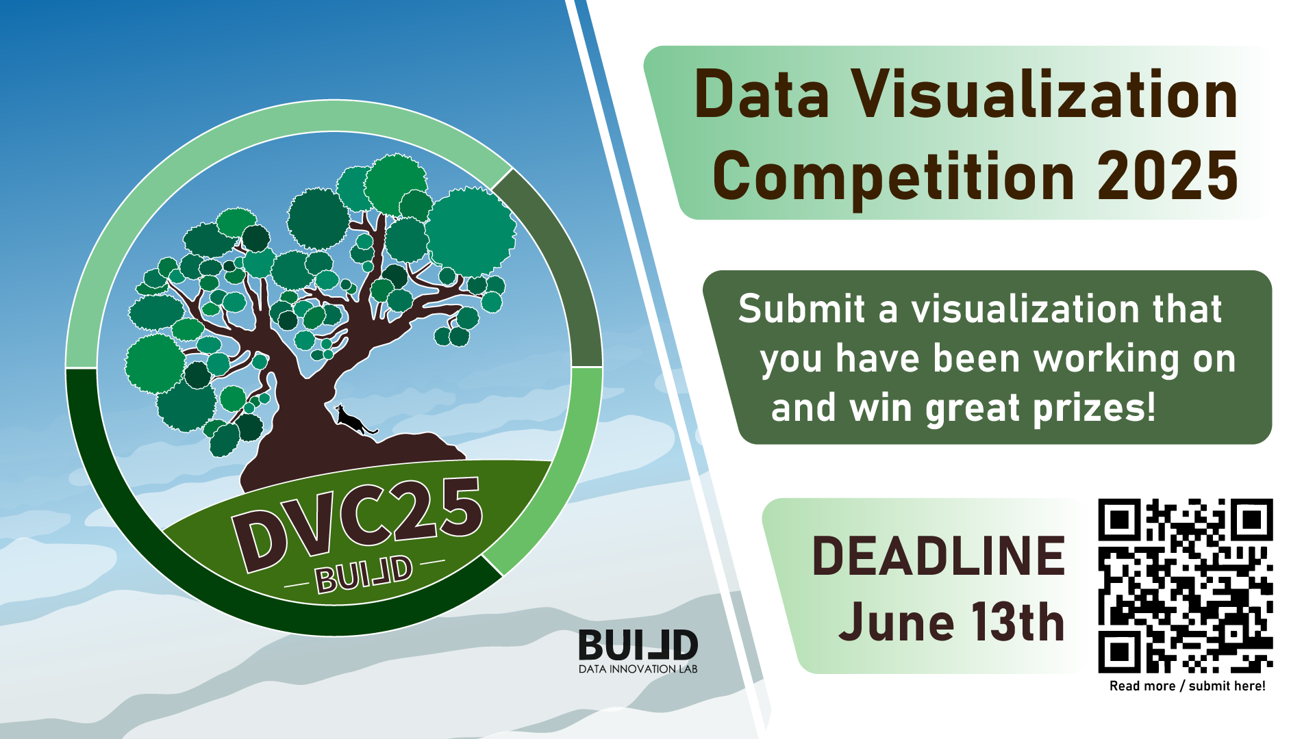
Data Visualization Competition 2025
View results for this event here: https://build.itu.dk/dvc25
Another year has passed, another Data Visualization Competition is upon us! You and/or your group is invited to showcase the creativity in crafting unique and impactful data visualizations for a chance to win great prizes!
If you’re already crafting or crafted a data visualization for your research purposes, why not submit it and get recognized for your work? Or maybe you’d like a second opinion before you submit for your exam? We welcome all types of data visualizations, both qualitative and quantitative. The top 5 winning visualizations will be proudly displayed on BUILD lab’s website and ITU screens, celebrating your talent and creativity.
In addition, the top 3 teams or individuals will receive exclusive goodies and greater prizes based on their placement (including giftcards)! So, whether you’re competing solo or as a group, there’s plenty of incentive to participate!
Conditions:
-
- All data visualizations are welcome that are made by YOU!
- You can either submit as an individual or as a group.
- You can submit multiple visualizations if they are from the same project, otherwise, you have to make separate submissions.
- You can submit your visualizations containing animations if they serve a purpose.
- You can submit your visualizations just to receive feedback from the BUILD lab if you want to.
However,
-
- The visualization must be made in either Summer 2024, Autumn 2024 or Spring 2025 semesters.
- The visualization must be made by YOU for your own project/thesis (there are no restrictions as to what methods/tools you used).
- You have to describe your visualization in 100 words or less (if possible).
Submit yours here: https://forms.office.com/e/F3p2gJKqEz (ITU login required)
You will be graded on the visual design as well as how you were able to transfer your insights into a visualization form. If you are still unsure, contact build@itu.dk for clarifications.
Impress our BUILD lab judges with your innovative and informative projects by the June 13th 23:59. Don’t miss out on this fantastic opportunity to exhibit your talents, have fun, and win exciting rewards. Submit your entries now and may the best visualization win!
Thrilled to watch your graphs “deciding” on new paths 😊
Visualization inspired by Minna Sundberg’s illustration