Authors: Christian S. Fleischer, Hugo L. Hoydal & Sander E. Thilo
The visualization showcases the performance of all clubs that have participated in the Premier League, the first division of English football, over its 30 years of existence. Clubs that have played in the league for all 30 seasons, as well as teams that have participated in at least one season are included.
Each spike on the graph represents the club’s final position in a single season, taller spikes indicate higher positions, while golden ones indicate that the club had won the premier league.
To interact with the visualization and learn more, click here
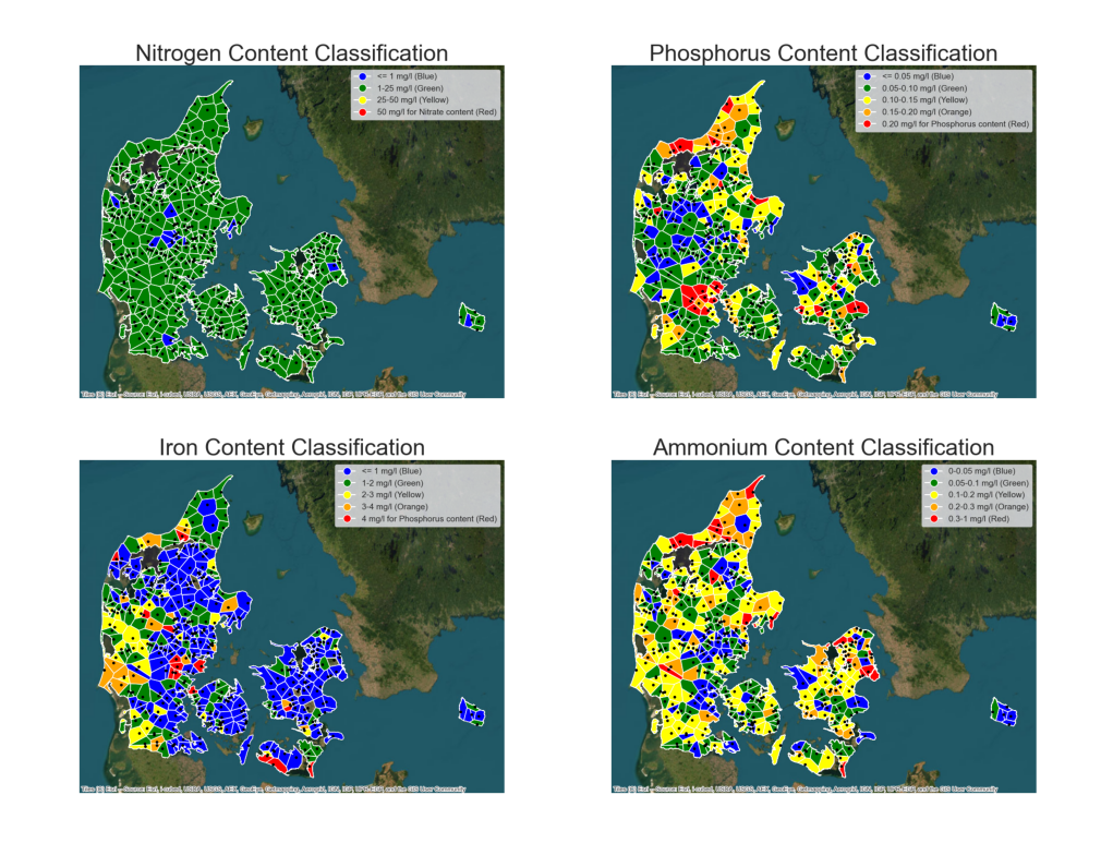
2nd place: Danish Water Ecology (52/75 points)
Author: Philip Winstrøm-Jespersen
The grid of visualizations cover the Danish Water Ecology. The four chemical components which are the strongest indicators are “Phosphor”, “Nitrate”, “Ammonium” and “Iron” are then evaluated accordingly to 5 classifications: Excellent, Good, Moderate, Poor and Bad.
Thiessens polygons (Voronai-polygons) were used to fit the boundary of Denmark, while the color represented the quality classifications. The spatial geo-biological base has been selected to showcase forests and coasts more clearly.
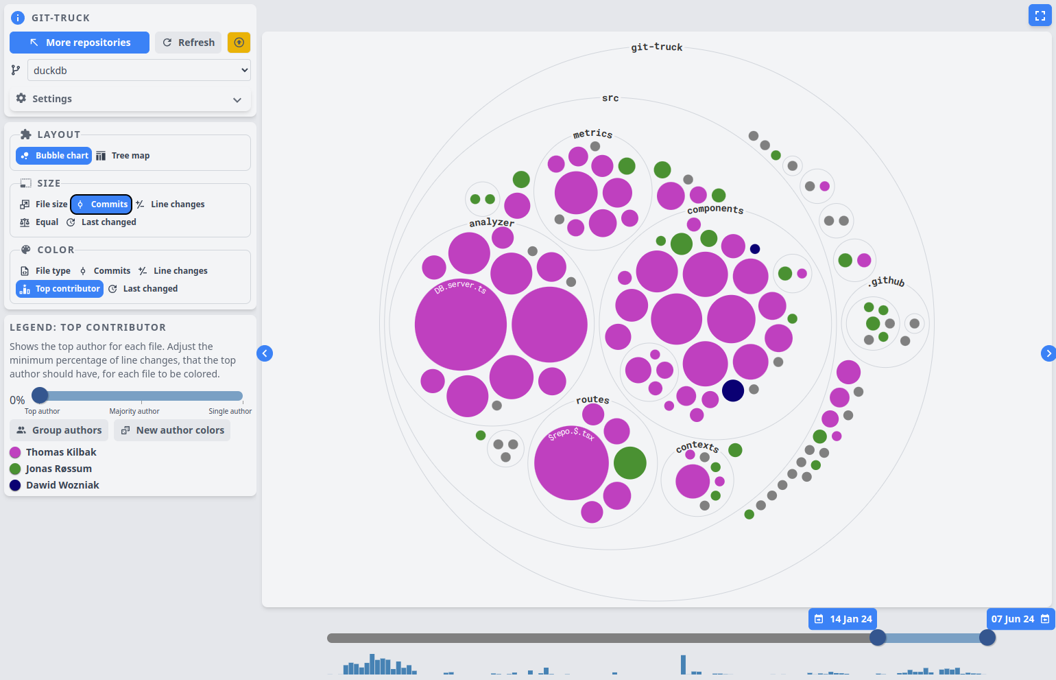
3rd Place: Git Repository Hierarchy (49/75)
Author: Thomas H. Kilbak
Visualizes the file structure of git repositories hierarchically. The size and color of each file is determined using various metrics, which the user can choose. In the image, the size of a file relates to the number of commits to it, and the color relates to the person who has done the most work on it. At the bottom, a historigram shows when there has been the most commit activity, and the user can choose which time range to analyze by moving the slider handles.
To interact with the visualization go to a repo in the terminal and run: npx git-truck@duck. Requires node.js.
Runner up: The Football Transfer Game (46/75 points)
Authors: Sebastian In Soo Nygård Wærling, Andreas K. Svenningsen, Bent J. Heinks
A dashboard visualizing football transfers within and between the top 5 European football leagues. A flow map shows the flow of transfer fees between the leagues while a scatterplot shows the relationship between transfer incomes and expenses for each league and season. The data covers the 2018/19 to the 2022/23 season.
It is possible to interact with the dashboard by filtering on the league and season. A club can also be chosen by selecting a club icon in the bar chart, which will affect the tables shown on the right. The dashboard shows the economical dominance by the English Premier League, but can also be explored to find your own story.
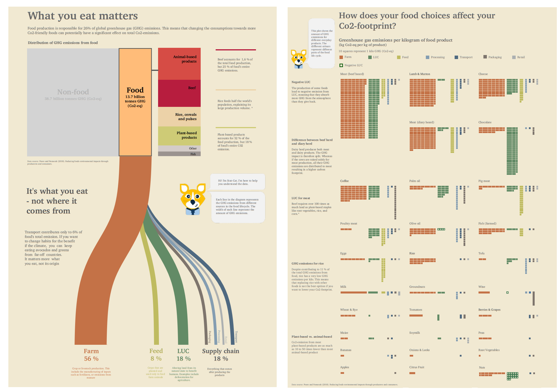
Runner up: What You Eat Matters (44/75)
Authors: Ida Ugilt Ege Wennergård, Julie Langeland Hagen, Thea Karoline Riis Kristensen
The visualization focuses on green house gas emission from food.
The left side emphasizes the importance of food choices with a Sankey diagram showing the distribution of GHG emissions coming from food. The right section focuses on the GHG emissions per kilogram of various food products.
We use cookies to ensure that we give you the best experience on our website. If you continue to use this site we will assume that you are happy with it.