Data Visualization Competition 2026Β Results

πŸƒβ€β™‚οΈ Runner-up πŸƒβ€β™‚οΈ
Human Development Index

Taha Zaman Khan Khattak,
Matthew NaΓ±aga Rangstrup,
Malik Jensen

The dashboard visualises the UNDP developement data.

The target audience is anyone intrested in finding their country’s performance over time across different metrics. Users can interact with the dashboard and explore different metrics, such as the Human Developement Index, Schooling, GNI, and life expectancy.

The dashboard at each stage helps users compare their metrics with other countries, and also see differences in gender. As an example a user can see how a certain country’s difference in mean years of schooling between men and women has changed over time.

At the end users are given the freedom to explore different metrics by varying the X,Y axis, Size of circles, Year etc. in a scatter plot.

Click here to view the full visualization

πŸƒβ€β™‚οΈ Runner-up πŸƒβ€β™‚οΈ
Strava Performance Dashboard

Stella Petrova Boneva,
Emil Sander Korczak,
Joakim Smidsgaard Andersen

The dashboard visualizes personal Strava running metrics using a dark theme with signature orange highlights.

The top panel tracks yearly mileage, calories, and cumulative elevation gain against Mount Everest. The central Analysis Section displays a map of routes color-coded by pace, a detailed breakdown of heart rate and zones, and a speedometer gauge for run velocity. On the right, a Comparison Section utilizes radar charts and long-term PR sparklines to allow for comparison between friends. Finally, an interactive annual Calendar filter at the bottom maps training consistency over time.

Click here to view the full visualization

πŸ₯‰ 3rd place πŸ₯‰

It’s raining money!

Asta Trier Wang,
Philip MΓΌnster-Hansen

It’s Raining Money visualizes the uneven rise of Danish home prices from 1996 to 2025.

Using banknotes as a playful unit, it compares municipal price increases, highlights widening gaps such as Frederiksberg versus the national average, and connects housing affordability to migration patterns across Denmark.

Click here to view the full visualization

...

πŸ₯ˆ 2nd place πŸ₯ˆ

Musical Identities

Maribel Yazmin Preite,
Gabija MakutenaitΔ—,
Ashanti Costa MartinsΒ 

Inspired by Spotify Wrapped, this project elevates personal listening summaries into an interactive exploration of group listening behavior.

By comparing lifetime Spotify histories across multiple users, it uncovers shared musical interests, evolving tastes, and unique listening patterns, transforming individual data into a collective story of music and connection.

Click here to view the full visualization

πŸ₯‡ 1st place πŸ₯‡

How did Russia’s invasion of Ukraine affect arms trade?

Marius Salcutan, Maja Kalina Oska

The visualizations act as a journalistic storyboard visualizes the effects of Russia’s invasion of Ukraine on the global arms trade.

It uses data from the Arms Transfers Database (SIPRI). We sought to identify patterns in arms trade that can help anticipate military activity, as both Russian invasions of Ukraine were preceded by a substantial reduction in Russian arms exports; along with finding which countries filled the gap left by Russia’s declining exports.

Another year has passed, another Data Visualization Competition is upon us!β€―You and/or your group is invited to showcase the creativity in crafting unique and impactful data visualizations for a chance toβ€―win great prizes! 

If you’re already crafting or crafted a data visualization for your research purposes, why not submit it and get recognized for your work? Or maybe you’d like a second opinion before you submit for your exam? We welcome all types of data visualizations, either or both qualitative and quantitative. The top 5 winning visualizations will be proudly showcased,β€―celebrating your talent and creativity. 

Conditions:

All data visualizations are welcomeβ€―that are made by YOU!Β 

    • Youβ€―canβ€―either submit as anβ€―individualβ€―or asβ€―a group.Β 
    • Youβ€―canβ€―submit multiple visualizations if they are from the same project, otherwise, you have to make separate submissions.Β 
    • Youβ€―canβ€―submit your visualizations containingβ€―animationsβ€―if they serve a purpose.Β 
    • Youβ€―canβ€―submit your visualizations just toβ€―receive feedbackβ€―from the BUILD lab if you want to.Β 

However,

    • The visualizationmustΒ beΒ made in eitherΒ Summer 2025,Β Autumn 2025Β orΒ Spring 2026Β semesters.
    • The visualization mustΒ beΒ made by YOUΒ for your own project/thesis (there are no restrictions as to what methods/tools you used).
    • You have to describe your visualization in 100 words or less (if possible).
  • Β 

Submit yours here:Β https://forms.office.com/e/F3p2gJKqEz (ITU login required)

You will be graded on the visual design as well as how you were able to transfer your insights into a visualization form.Β If you are still unsure, contactΒ build@itu.dkΒ for clarifications.

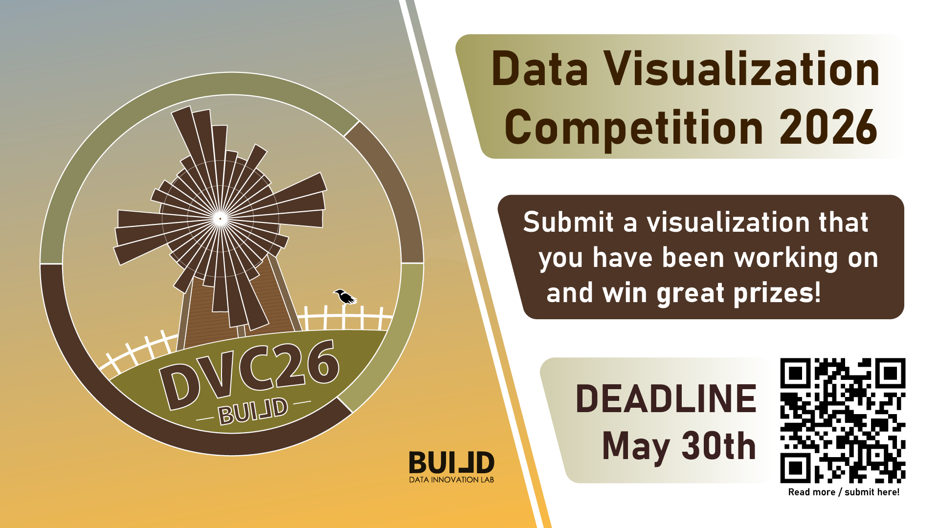
Impress our BUILD lab judges with your innovative and informative projects by the May 30th 23:59. Don’t miss out on this fantastic opportunity to exhibit your talents, have fun, and win exciting rewards. Submit your entries now and may the best visualization win! 

Winners from the previous years

Can’t wait for you to chart us a course to a gradient descent and blow us away with your visuals πŸ˜Š 

Illustration inspired by Geoff Boeing’s City Street Orientation Visualization