
- This event has passed.
Data Visualization Competition 2023 Results
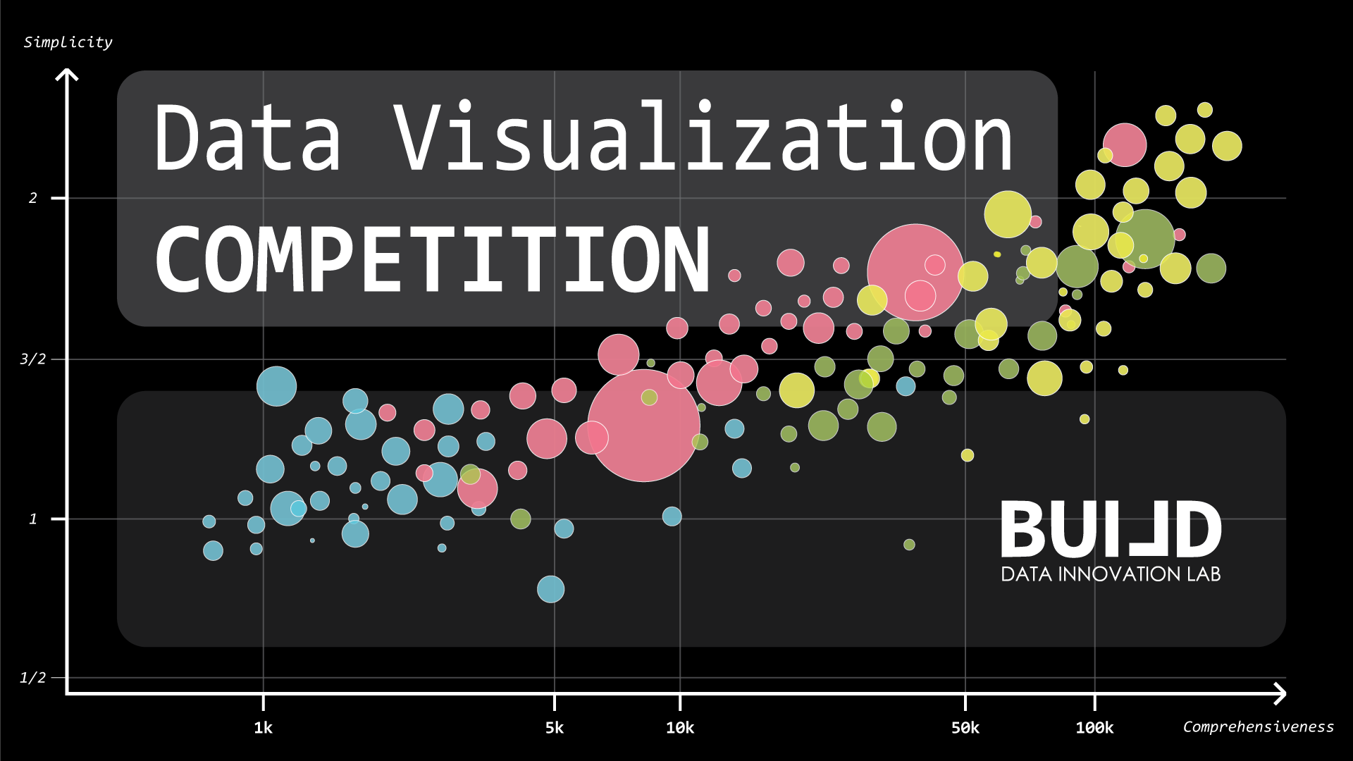
1st Place (36 out 50 points)
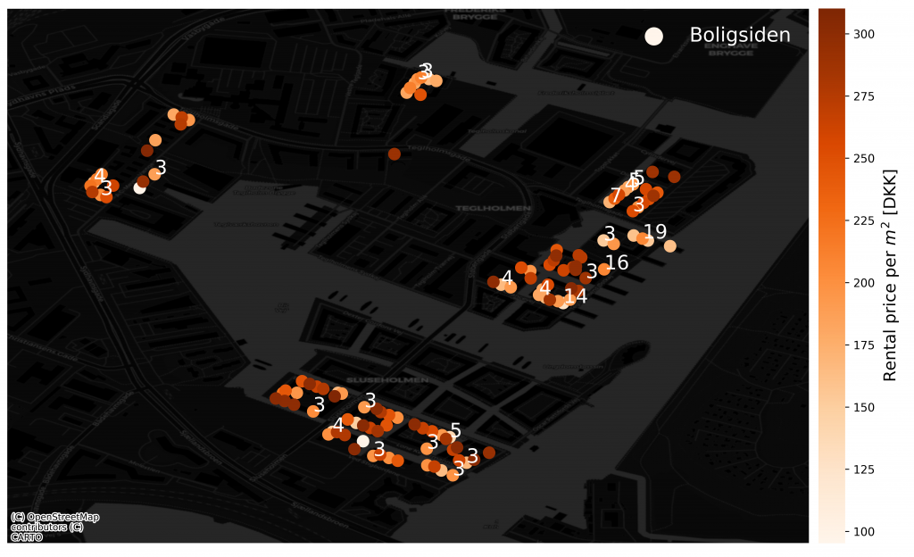
Boligsiden Apartments Sydhavn
Author: Szymon Adam Galecki
The figure showcases apartments for rent, available at boligsiden.dk. It was one of the figures that showed company’s strategy, having multiple flats in recently finished buildings. Points represent buildings in location given by geographical coordinates. If there are more than two apartments at the same location, a numerical label informs about it.
Colour scheme informs about rental price for square meter, in a month timeframe. Since, buildings were finished at very similar time, their standard should be similar. Colours will tell us where to look for good deals. Rent prices for square meter, for apartments in the same location have been averaged.
2nd Place (34 out of 50 points)
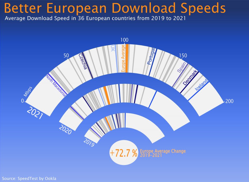
Better European Download Speeds
Authors: Altea Fogh, Jakob Cordua Thibodeau
The representation depicts the increase in internet download speeds across Europe. This “Wi-fi” plot is a stacked gauge plot, with each bar representing a year, the angle representing internet download speed and the strikes representing European countries.
The shades of blue are variations of the hyperlink blue. the orange is used to contrast and highlight the European average (colour-blind friendly). The bottom dot emphasises the main point of the visualisation, that European download speeds are increasing. The angled axis makes year to year comparisons easy, and emphasises the spread between the fastest and slowest country.
3rd Place (33 out of 50 points)
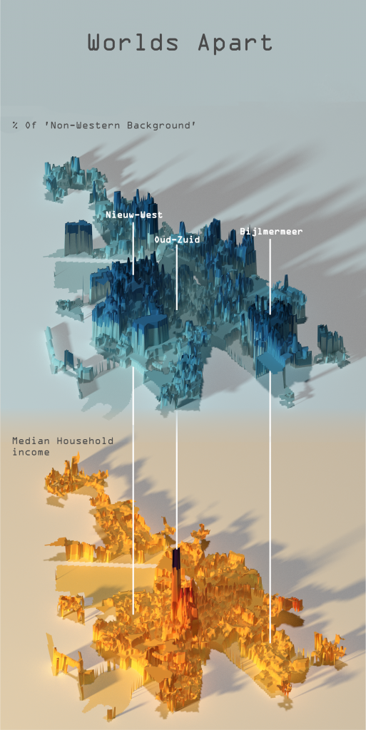
Worlds Apart – Amsterdam’s ethnical/income distribution and air pollution
Authors: Gusts Gustavs Grinbergs, David Peter Süle
This visualizations shows an interesting correlation between the wealth distribution in Amsterdam with the % of people with non-western backgrounds.
The blueish 3D plot depicts % of people with a non-western background, while the orange one depicts median income scattered around all of Amsterdam. The 3 white lines in the 3D visual depict different neighborhoods (while appearing as gray dots in the two plots) and can be used as a point of reference.
The two pollution plots balance the top two plots by showing no difference in the amount of pollution between the less and more fortunate areas. This combination of plots tries to provide a balanced picture of the socioeconomic state of Amsterdam.
Runner-up (31 out of 50 points)

Various interactive visualizations of Stardew Valley
Authors: Nikolette Zoe Pedersen, Michal Rynowiecky, Regitze Julie Synedal
The are 3 interactive data visualizations about the video game Stardew Valley. The visualizations are combined in one themed interface, which allows for quick overviews to the players.
The main demonstrated visualization shows profit of crops per season, which one would return the most amount of profit based on the investment. Another visualization would showcase the likes and dislikes of a romantic interest, and one that demonstrates the damage caused by a sword.
As the interface is set to be interactive, the main utility for the players comes from it.
Runner-up (30 out 50 points)
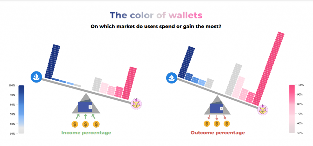
The color of wallets with in NFT markets
Author: Alessia Galdeman
Within the thriving NFT ecosystem, users engage across various markets, but where do their primary spending and gains occur?
The visualization investigates user activity across two prominent markets: OpenSea (represented in blue) and Cryptokitties (represented in pink).
Its goal is to unveil the dominant market for income and outcome, effectively revealing the color of their wallets. Each brick on the scale represents 200 users, with the intensity of its color correlating to the proportion of income or outcome they gain or spend in the corresponding market.